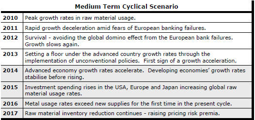
The Current View
Growth in demand for raw materials peaked in late 2010. Since then, supply growth has continued to outstrip demand leading to inventory rebuilding or spare production capacity. With the risk of shortages greatly reduced, prices have lost their risk premia and are tending toward marginal production costs to rebalance markets.
To move to the next phase of the cycle, an acceleration in global output growth will be required to boost raw material demand by enough to stabilise metal inventories or utilise excess capacity.
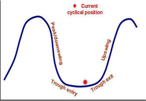
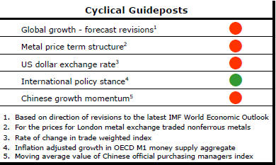
The PortfolioDirect cyclical
guideposts suggest that the best possible macroeconomic circumstances for
the resources sector will involve a sequence of upward revisions to
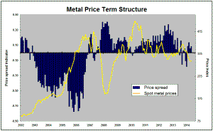
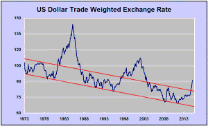
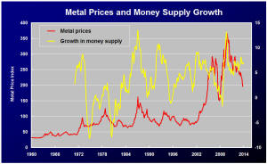
global growth forecasts, the term structure of metal prices once again
reflecting rising near term shortages, a weakening US dollar, strong money
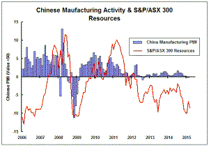
supply growth rates and positive Chinese growth momentum. Only one of
the five guideposts is "set to green" suggesting the sector remains confined
to the bottom of the cycle .
Has Anything Changed?
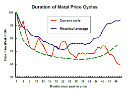
Throughout 2014, PortfolioDirect had been characterising the cyclical position as ’Trough Entry’ with some expectation that by the end of 2015 an exit would be evident. Until very late in the year, the evidence supported that possibility before conditions took several backward steps.
The absence of a growth acceleration among the major economic regions other than the USA is contributing to the flagging momentum. A stronger US dollar is also imparting a downward bias to US dollar denominated prices presently. This is looking less like a temporary move than a multiyear change of direction.
The ECB has foreshadowed more monetary stimulus measures. However, monetary polices supporting asset prices alone are unable to directly affect growth sufficiently to encourage a better outlook for resource sector equities.
Fears about the impact of low oil prices have affected sentiment adversely. The beneficial effect of lower oil prices on demand within the advanced economies has not yet been felt and is still being underestimated as a source of additional output growth.
Higher Inventories Confirm US Business
Improvements
Inventory movements can be difficult to interpret since a rise could be due
to failing sales or improving expectations on the part of business about
future demand.
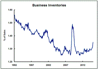
The long-term trend to lower inventories - typified by just-in-time logistical planning - had largely run its course within US businesses before the global financial crisis which resulted in an unplanned surge in the sales/inventory ratio. Having first adjusted to more normal levels after the crisis, there has been a renewed upward trend In the sales/inventory ratio.
The rapid rise reported for the December-January period is a concern, reflecting some softening in demand, but the upward momentum has been ongoing for sufficiently long to justify an inference that business conditions have been improving. Of course, analysts had already known as much. The inventory statistics go some way to confirming and quantifying the size of the improvement.
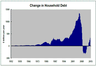
Modest Rises in US Household Debt
US household debt has been rising at an accelerating but still modest pace.
The 2.5% rise in household debt over the year to December 2014, as measured
by the US Federal Reserve financial accounts report, is the strongest rise
since the June quarter of 2008 when the
 process
of moderating debt growth had already been underway for two years.
process
of moderating debt growth had already been underway for two years.
The willingness of households to resume rebuilding debt levels will be related to the state of US labour markets and, more particularly, increases in wages which have remained low by historical standards. Real estate values will also play a role against the backdrop of the 2008-09 slump in house prices.
Reluctance to rebuild debt levels adds stability to the economic outlook but also reduces the ongoing potential growth rate. A commitment to higher household debt, while bringing with it some unfortunate connotations about financial stability, would be a signal that the US may be capable of providing a stronger contribution to global growth.
Slow Growth in Australian Gold Output
Australia's gold industry Is not reproducing the rapid output growth which
came about in the 1980s in a lagged response to higher gold prices.
A similar tripling in the gold price currently underway
has potentially improved project economics but the output response has been
muted. The net effect appears to have been to sustain existing production
rather than cause a rise in output levels. 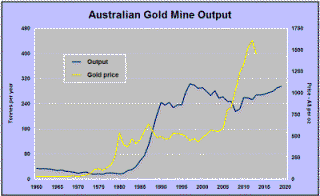
One difference between now and the 1980s experience is the opportunity in the earlier period to apply new processing technologies to known areas of mineralisation and historic mining activity. There has not been a comparable boost in the current cycle in which miners have had to contend more frequently with finding deeper or more complex orebodies to develop with less well understood geology.
The Commonwealth Department of Industry and Science has released an updated long term industry forecast pointing to gold mine production in 2019/20 of only 293 tonnes. This would be a growth rate since 2013-14 of just 1% a year.
Low output growth and continuing upward cost pressures, albeit slightly less pronounced as a result of reduced energy and labour costs, do not bode well for the industry's investment attractiveness which hangs increasingly on an improvement in gold prices or further Australian dollar currency depreciation and less on its organic growth potential.