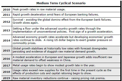
The Current View
Growth in demand for raw materials peaked in late 2010. Since then, supply growth has continued to outstrip demand leading to inventory rebuilding or spare production capacity. With the risk of shortages greatly reduced, prices have lost their risk premia and are tending toward marginal production costs to rebalance markets.
To move to the next phase of the cycle, an acceleration in global output growth will be required to boost raw material demand by enough to stabilise metal inventories or utilise excess capacity.
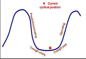
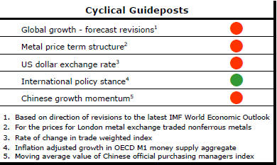
The PortfolioDirect cyclical
guideposts suggest that the best possible macroeconomic circumstances for
the resources sector will involve a sequence of upward revisions to
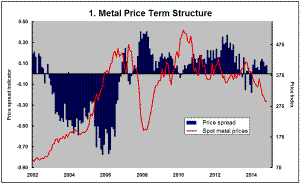
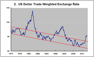
global growth forecasts, the term structure of metal prices once again
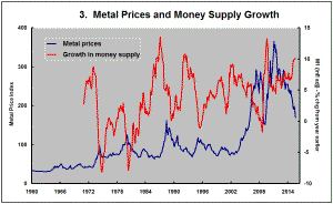
reflecting rising near term shortages, a weakening US dollar, strong money
supply growth rates and positive Chinese growth momentum. Only one of
the five guideposts is "set to green" suggesting the sector remains confined
to the bottom of the cycle .
Has Anything Changed?
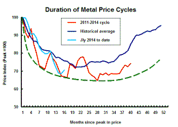
Throughout 2014, PortfolioDirect had been characterising the cyclical position as ’Trough Entry’ with some expectation that by the end of 2014 an exit would be evident. Until very late in the year, the evidence supported that possibility before conditions took several backward steps.
The absence of a growth acceleration among the major economic regions is contributing to the flagging momentum. A stronger US dollar is also imparting a downward bias to US dollar denominated prices presently.
This change has been enough to define a fresh cycle and a more prolonged adjustment process.
China Growth Perspectives
China reported growth in GDP of 6.9% over the year to the end of September
2015. For those who have been fixated on the 7% growth target, this was
slightly disappointing. Those who had been expecting something worse
expressed relief. The different reactions came despite the statistical
insignificance of the difference between the reported number and 7%.
The report was considered significant despite widespread scepticism about the quality of Chinese national accounts data.
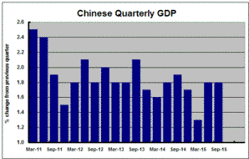
China’s way of reporting its annual results can also affect how results are interpreted. Australia, for example, typically reports its GDP as a percentage change from the preceding quarter. In the USA, on the other hand, GDP growth is usually reported as an annualised rate of quarterly change.
China reports GDP growth as the change from a year earlier. The chart illustrates quarterly changes for China’s GDP, as they would be reported in Australia, since 2011.
The September quarter growth rate was 1.8% or, using the US format, 7.4% annualised. The September quarter result was the same as the result reported for the June quarter and not greatly out of line with the majority of quarterly results since 2012.
The supposed weakening trend in growth inferred from the way in which China reports its results has arisen from an unusually poor March quarter 2015 outcome. The March result is no less real for being an outlier but the data, viewed in this fashion, suggests the possibility that an improvement in China’s economic performance has already commenced rather than the country being at the beginning of a slowdown.
Of course, such a conclusion presupposes that the numbers have not been concocted by an autocratic government looking to secure its political fortunes or by officials seeking to curry favour with the political leadership.
China's Changing Economic
Structure
Chinese service sector growth is outstripping growth in the rest of the
economy. The Chinese government reported that the tertiary sector of the
economy expanded by 8.6% over the year to the end of September, 2015.
Secondary industry output grew 5.8% and primary industry product grew 4.1%.
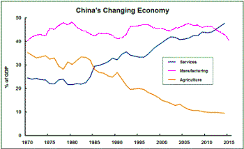
The relative growth rates are consistent with the desire of the Chinese government to rely more heavily on consumption spending for economic growth and employment.
The chart shows how the shares of the three economic sectors have been changing. The switch in emphasis toward the services sector has been under way for 30 years.
The main recent change has been the loss of manufacturing momentum which is the part of the Chinese economy with the most direct external linkages.
US Labour Conditions Support Market
U.S. labour market conditions remain the wind beneath the wings of the
equity market. Weekly jobless claims of 259,000 for the week ended 17
October were running at near historical low levels (reversed on the right
hand scale in the chart below) despite the growing size of the labour
force.
The low level of new jobless claims indicates reluctance
on the part of employers to shed labour which, in turn, should imply high
levels of business confidence. The mirror image of this business confidence
should be a building willingness on the part of employees to spend and
possibly even incur more debt to underpin a stronger rate of consumption
growth as they feel more secure in their jobs. 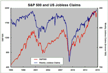
The recovery in equity prices since August has been consistent with these labour market signs and their implications about business and consumer confidence.
While these signs are about domestic U.S. economic activity, the preceding equity market weakness had been attributed to fears about sagging global activity. The competing domestic versus global influences on US markets are likely to remain a feature.
The domestic US influences appear to be holding sway once again although it is probably realistic to assume an end to the downtrend in jobless claims even in the near term as the momentum of labour market improvement inevitably slows.